Data journey and Caveats
Matthew:
The data journey started with finding a means of getting the data onto Google Colab. At first, we would have the excel download to the google colab page so that we could use pandas csv or xlsx open option. This was an annoying process to do and not easy for someone without the file to reproduce so we use Google Drive libraries to pull the data from a Google Drive link ID. We did this for the GDI, GDP, and country government type data. With the data we collected, we mostly didn’t need to do much cleaning or organizing besides removing unnecessary years and not available values. There was one case when trying to compare GDP and GDI over the years so we needed to melt the year columns into a row so that we could group by each year. Other than that, we just had to manipulate the data for the visualization. There were some cases of creating visualizations that were difficult to make work due to syntax. For example, it took a good amount of effort and understanding a new library to get the dual line/axis GDP and GDI over the years line graph. The hardest part of this project was setting up and learning how to program in HTML. I ended up using a template W3 School, an online coding help/training website. This gave me a structure and aesthetics to use to input our visualizations and information. Nonetheless, I still learned and edit the template to fit our project like having the images direct the uses to the visualizations
W3 Template Link: https://www.w3schools.com/css/css_rwd_templates.asp
Joyce:
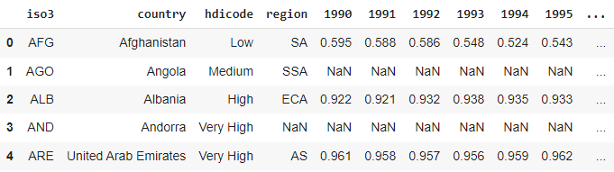
The first challenging part is to find the proper data source. We initially chose the CPIA gender equality rating, also a dataset from the United Nations, but it turns out to have so much unavailable data in the dataset. Fortunately, we were able to find UNDP data, which contains the gender inequality index for countries and also the gender development index. In the process of transferring original datasets to useful CSV files, it took time to clean the data, including the countries that have no data at all. When dealing with the gender inequality index for countries in 2021, it took effort to make meaningful visualizations. The final choices were made to present the data in terms of different regions. Such choices took another effort to add on the information of regions using another JSON data that includes geographic information of different countries in order to have continents information for the countries. Changes were made for the names of several countries that appeared in the CSV file in order to match that online JSON data, like changing “United States” to “United States of America.” This whole procedure took time since it first required an effort to test out which countries had different names in these separated data sources. Visualizations for scatterplots and choropleths were more of a time-consuming experience since they required attempts to test out which indicators were worth comparison and could generate meaningful conclusions. Besides, parallel coordinates plots were newly learned for comparing education and labor force participation. That turned out to be meaningful since it presented a clear image of males’ dominated advantage in labor force participation.